Job Title: UX/UI & Digital Strategist
Business Goals: Improve business for agency clients with strategy and project management of websites and ads.
Contributions: UX/UI, Facebook Ads, Google Ads, Instagram strategy, LinkedIn Ads, data analytics, etc.
Outcomes: Improved sales, higher relevance scores, better stakeholder relations, better client retention, business stability.
WebCO Logo Redesign
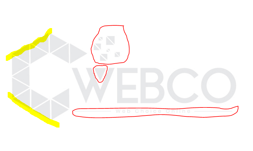
Logo included 15 colours, and tiny details that weren’t scalable. It was difficult to put it on a background colour that would be compatible. The graphic design was a bit dated. the only versions in existence were this square version, and a more inline version. Flat versions were necessary. I asked one of or graphic designers to make the triangles solid with consistent sizing and alignment, including gaps between.
Defining a concise style guide
There weren’t official hex codes in the brand, so I picked some to stick with, pulled recognizably from heavy use on the existing website. The blue was close to Pantone’s colour of the year and communicated a corporate trustworthiness and sense of professionalism that would resonate with a lot of our clients. The pink was more edgy and creative, alluding to the eye-catching necessity of a marketing company.
The flatness of this logo design looked too plain and also a bit dated. Strange grey circles appeared at the junctions, as a distracting optical illusion. The negative space fell awkwardly across pixels to sometimes look uneven.
Preference for linear version:
More aligned with “web” concept
Square versions for Favicon and Social profiles
Consistent Digital Identity + Brand Assets
Before & After
Website Redesign Mockup
BEFORE - Screenshot in Invision
PROTOTYPE
Designing on a Grid
This was so important. Our team of developers were not familiar with bootstrap or how a grid is used to define breakpoints for responsive design. From a graphic design perspective, the webpages looked slightly unsettling and wonky, but it can be hard to pinpoint what is actually strange about it. Subtly, the details did not line up, and some images were bigger than others. From here, you can adjust the design to switch from a desktop version to tablet, mobile, and to function properly if viewers on a desktop are adjusting their browser window to smaller dimensions. Once you have an agnostic design worked out, you can adjust further for the conventions of Android or iOS, and more specific aspect ratios from there (example an iPhone 7 vs iPhone X, where there is no longer a “home” button and swipe functions or button placement may need to be revised).
Desktop User Behaviour
A lot of people were clicking on certain logos in the “trusted by” section, giving some indication of which projects we should showcase more readily as case studies.


